http://www.worldmapsonline.com/np_geo/oceania_bathymetry_lg.htm
This Bathymetric map shows the sea floor for Oceania. Note the attention that it gives to the elevation of the sea floor.
Monday, November 21, 2011
Sunday, November 20, 2011
Correlation matrix
http://www.renci.org/~sthakur/figs/Poly_Vis_similarity_matrix.jpg
This matrix show the similarity of two different chemical polymers.
Stem and leaf plot
http://mdk12.org/instruction/curriculum/mathematics/graph_stem.html
This simple stem and leaf plot chows the heights of several children in centimeters.
Box plot
http://itl.nist.gov/div898/handbook/eda/section3/boxplot.htm
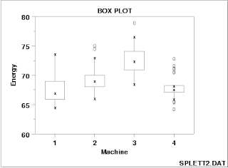
These box plots compare the energy output of four different machines.
Histogram
http://www.worsleyschool.net/science/files/bargraphs/page.html
This simple histogram shows the frequency of certain masses of fish.
Parallel coordinate graph
http://www.whopaidthem.com/
This plot shows the results of a test that was meant to guess the test takers understanding of political funding.
Triangular plot
http://psychology.wikia.com/wiki/Lineage_(evolution)
Triangle plots allow for three different things to be compared. In this example shows where certain ethnicities fall within three distinct groups.
Windrose
A windrose shows the percentage of time the wind blows a certain way over a specified period of time. This example is from a location in China. http://www.ncl.ucar.edu/Applications/rose.shtml
Climograph
http://met101.org/wiki/Climograph
A climograph gives an individual a visual representation of the climate in a particular place over a period of time. The temperature is represented by the line while the bars represent precipitation. This example shows the twin cities in Minnesota.
Population profile
A population profile is a visual representative of a population of some sort. It shows both age group and gender. In this case, the observer sees a profile of the inner docklands in Ireland. http://www.ucd.ie/news/2009/06JUN09/040609_dublin.html
Scatterplot
http://staff.argyll.epsb.ca/jreed/math9/strand4/4102.htm
A scatter plot allows two variables to be compared to each other and see what trends can emerge. In this case the user sees the relationship between temperature and elevation in Nevada.
Index value plot
This “map” allows one to follow a trend over time. In this case the observer can see the change in return on closing based on the index. http://mohapl.dyndns.org/marketpred.html
Lorenz curve
http://www.unc.edu/depts/econ/byrns_web/Economicae/Figures/Lorenz.htm
A Lorenz curve shows the gap between two variables, this is usually used in economics.
Bilateral graph
A bilateral graph allows one to compare to different things on the same graph. In this case, the graph on the left one can compare two different exchange rates for the yen. http://www.emeraldinsight.com/fig/266_10_1108_S1574-8715_2011_0000009010.png
Nominal area choropleth map
A Nominal area choropleth map shows categories that are unranked; one category is not better or worse than another. This map shows what states have the largest populations of what minorities. https://www.e-education.psu.edu/natureofgeoinfo/book/export/html/1553
Unstandardized choropleth map
https://www.e-education.psu.edu/natureofgeoinfo/book/export/html/1553
These maps show raw data without adjusting for population in any way. This map looks at the change in the number of individuals in the house of representatives.
These maps show raw data without adjusting for population in any way. This map looks at the change in the number of individuals in the house of representatives.
Standardized choropleth map
http://www.statcan.gc.ca/pub/92f0138m/2008003/figures/5200001-eng.htm
Standardized maps are made so that different areas can be compared to each other with out having to worry about population. This map looks at the percentage of the population under the age of 14 in Canada.
Standardized maps are made so that different areas can be compared to each other with out having to worry about population. This map looks at the percentage of the population under the age of 14 in Canada.
Univariate choropleth map
http://my.ilstu.edu/~jrcarter/Geo204/Choro/Tom/
This is a choropleth map that only describes one variable. In this case it is looking how many of the condo owners in California are black.
Bivariate choropleth map
http://www.geo.uzh.ch/~annal/Choropleth%20maps.html
A Bivariate choropleth map has two different variable on the same map. The two variables used in this map are percentage of rural population as well as percentage of population under the age of 18. The location explored is Poland.
A Bivariate choropleth map has two different variable on the same map. The two variables used in this map are percentage of rural population as well as percentage of population under the age of 18. The location explored is Poland.
Unclassed choropleth map
This map continuously shows the divorce rates in the US. Note that the distribution is smooth and there are no distinct classes. http://www.esri.com/news/arcuser/1003/files/choropleth.pdf
Classed choropleth maps
http://hci.stanford.edu/jheer/files/zoo/
This classed choropleth map uses colors to show differences in obese populations. The darker red the color is, the darker the color used. This is separated into distinct categories--as if it is data from a histogram.
This classed choropleth map uses colors to show differences in obese populations. The darker red the color is, the darker the color used. This is separated into distinct categories--as if it is data from a histogram.
Continuously variable proportional circle map
In this map, the size of the circle changes based on the amount of individuals that drink wine in a specific country in Europe.
*NOTE: this is not from a map bloghttp://maritimearchaeologyandgis.blogspot.com/2011/03/module-7-proportional-map-symbols.html
Range graded proportional circle map
This map uses different circle sizes to show what the perceived scenic value of a location in a park is. Due to the fact that the circle size is set to the scenic value, the number or circles used represents the amount of “votes” http://www2.unca.edu/farmlandvalues/pdfs/maps/Farmland_Values_Project_Community_Mapping_Activity_Proportional_Circles_Cultural.pdf
DOQQ
http://www.cas.sc.edu/sciaa/mrd/sdamp_mht_crht_vt_doqq.html
DOQQs are maps that were originally areal photos. The map is altered so that it can be used as a flat map. This map shows a nature trail in South Carolina.
DEM
http://www.geo.ed.ac.uk/home/scotland/scotland_dem_map.gif
Digital Elevation models are used to show relief. This DEM map shows the changes in elevation in Scotland
DLG
http://eros.usgs.gov/#/Find_Data/Products_and_Data_Available/DLGs
DLG maps are composed of vector data that can show a great variety of information.This map shows both hydrology and transportation in Tennessee.
DRG
http://www.geology.enr.state.nc.us/maps/drg.html
DRGs are scanned images of a topographical map. This Digital Raster Graphic shows a location in North Carolina.
DRGs are scanned images of a topographical map. This Digital Raster Graphic shows a location in North Carolina.
Isopleth
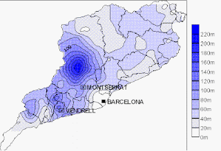
An Isopleth map is one that has data averaged out and displayed as a gradual variable. This map shows the gradual change in approximate rain levels over an area near Barcelona
http://geographyfieldwork.com/DataPresentationMappingTechniques.htm
Saturday, November 19, 2011
Isohyets
Isohyets are used to see rainfall .This map shows rainfall for some of the wetlands in Argentina.
Isotachs
http://www.erh.noaa.gov/gsp/localdat/cases/2009/1-2March2009Snow/300mb_Ageo_Wind_Omega_12Z_1Mar09.jpg
Isotachs are used to visualize wind speed. This map shows wind speeds in the southeast US.
Isobars
An isobar is a closed line showing an area of atmospheric pressure. This map of Europe shows us the atmospheric pressure of France.
LIDAR
Light Detection and Ranging maps use laser pulses to create a map. This map shows us The damage done to a beach by hurricane Isabelle
Doppler radar
Doppler radar uses the Doppler effect to create a map of cloud shape and velocity. This image shows us Hurricane Claudette.
Black & white aerial photo
Black and white images are images that are merely showing what a person could see without color. This photo shows us an aerial image of New Guinea.
Infrared aerial photo
Infrared images pick up energy that falls outside of human vision and adds color to them. This photo shows us how different vegetation can be seen using an infrared map.
Cartographic animation
http://ucdata.berkeley.edu/rsfcensus/graphics/lightshowpercent.gif
Cartographic animations use movement to show something. This dynamic map shows us population density through lighting. Click on the image to see the animation.
Statistical Map
Statistical maps are normal maps with data superimposed on them. This map shows the levels of obesity in different countries. Obese countries are marked as being more red than less obese nations.
Cartogram
Cartograms are maps that are distorted based on the data but still look somewhat like what area the map is portraying. This map shows the voting patterns in the 2004 presidential election.
Flow map
This flow map shows the emigration and immigration to and from the UK. Note that the arrows show the path that individuals take as they move both out of and into the country.
Isoline map
Isolines are used to show show distributions. This map shows the weather in Detroit. Notice how different colors are used to display different values, and that areas segregated by following the distribution.
Proportional circle map
A proportional circle maps uses circles of varying sizes to show a value. This map shows the energy consumption of homes in London. The larger the circle the more energy a home or building uses.
Choropleth map
Choropleth maps are areal style maps that are used to display data. This map shows the percentage of Hispanics found in counties in Florida.This example is aerially averaged.
Dot distribution map
Dot distribution maps use dots to show the location of something. Note that all the dots are the same size and represent the same value. This map shows locations where threatened fish species have been located. The more dots one sees in an areas the more fish are located there.
Propaganda map
This propaganda map shows Winston Churchill as an octopus meddling in Africa. This was used by the Algerians to influence their people during WWII. Propaganda maps are more about influencing people rather than educating them.
Hypsometric map
This Hypsometric map shows the High Plateau of the federal district in Brazil. Different colors represent different elevations.
PLSS map
The US public land survey is responsible for PLSS maps. The maps are incredibly systematic as can be seen in this example. This map shows the Southeast region of the United States.
Cadastral map
A Cadastral map is also often called a land partitioning system. This map shows how lands are parceled out in the town of Monrovia in Liberia. Note how the plots are outlined in yellow.
Thematic map
http://soils.usda.gov/use/thematic/moist_regimes.html
A thematic map is a map that has information, only related to the map by location, placed over the map to display information. This map shows soil moisture in the US.
A thematic map is a map that has information, only related to the map by location, placed over the map to display information. This map shows soil moisture in the US.
Topographic map
A topographic map is used to show elevation. Contour lines can be seen in the map to show the different elevations. This is a map of a valley in Utah.
Subscribe to:
Comments (Atom)


